|
Avoid a Confusing Site Structure
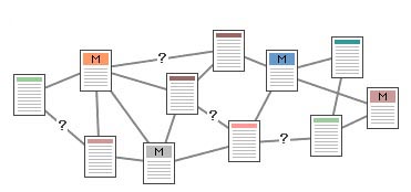
Without proper structure, your web site will be difficult to navigate
through, and will confuse the user. The navigation sequence should
be very clear so that the user can get to the desired page in the
most logical and obvious way. |
The Internet is Non-Linear, so
Design Accordingly
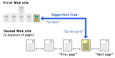
The Internet and web sites, as opposed to books, are non-linear.Links
from a web page can take you to another page on the same site, or
a page on an entirely different site. For example, a link from the
Middlebury College web site could take you to another page on the
Middlebury College site, or to a page on the Williams College web
site. Once in the Williams web site, the user can return to the
Middlebury site by clicking on the 'back' button of the web browser.On
the other hand, in order to go to a preceding page on the Williams
College site, the user must be able to click on a link on the page
of the Williams site that will take him to a preceding page. If
such a link does not exist, the user will be frustrated! |
Avoid Deep Sites by Using Menus Wisely
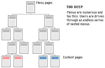
Avoid making your site too deep. Use menus that have atleast 3-4 options,
rather than often having one menu lead to another. In the site structure
shown above, the user is lead from one menu to another without access
to much information. |
Avoid Shallow Sites by Using Menus Wisely
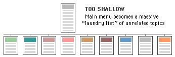
If your menu is too long, the user may not be able to find the desired
link quickly. Separate portions of your site under different sub-menus.
|
| |
|
|
 |
|
|


